The platform companies use to rent cars for their staff
Companies renting cars for their whole team need owners with full control, admins with flexibility, and drivers who just want to book without a maze of approvals. I designed three distinct journeys on one shared system — and watched them adopt it without a single confused support ticket.
The B2B Nightmare
Picture this: a tool for companies to manage vehicle rentals across their entire workforce. Sounds simple enough — until "companies" turns out to mean three different people with three different jobs, all needing access to the same system.
- Owners who want total control over everything
- Admins who want flexibility within their perimeter
- Drivers who just want to book a car without jumping through hoops
- A ton of business rules — access rights, budgets, approvals
- An agile squad that moves fast but needs clarity
Without Getting Lost
I worked with the squad to clarify the functional scope. What do we absolutely need? What can wait? In B2B, everyone wants everything yesterday. My job: saying "okay, but here's what actually matters" — and backing it up with reasoning, not authority.
I mapped all roles and permissions, understood validation flows, and identified what needs to be visible where and when. Then I structured it so it made sense to a human — not just a database. A good information architect turns mess into clarity.
I created dedicated journeys for the Owner (overview, total control), the Admin (managing their perimeter), and the Driver (maximum simplicity). Everyone sees what they need, when they need it. No more, no less.
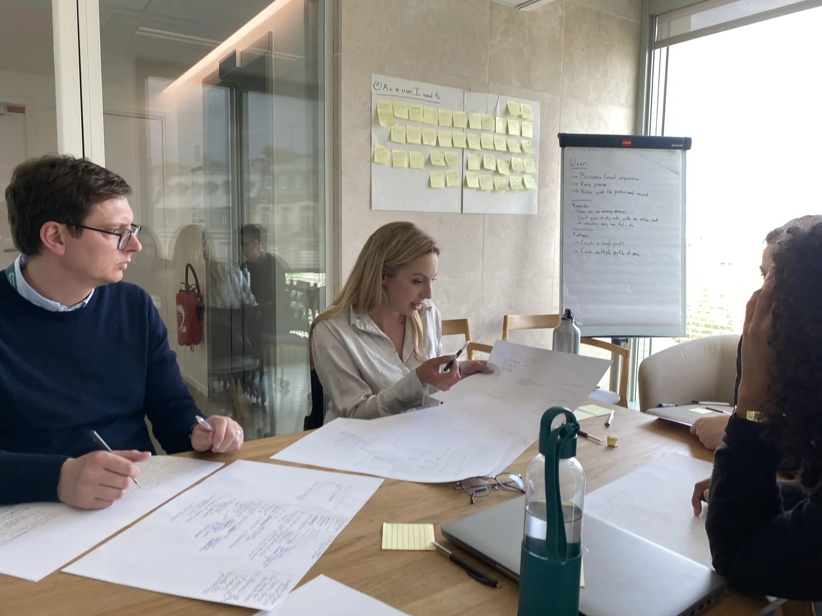
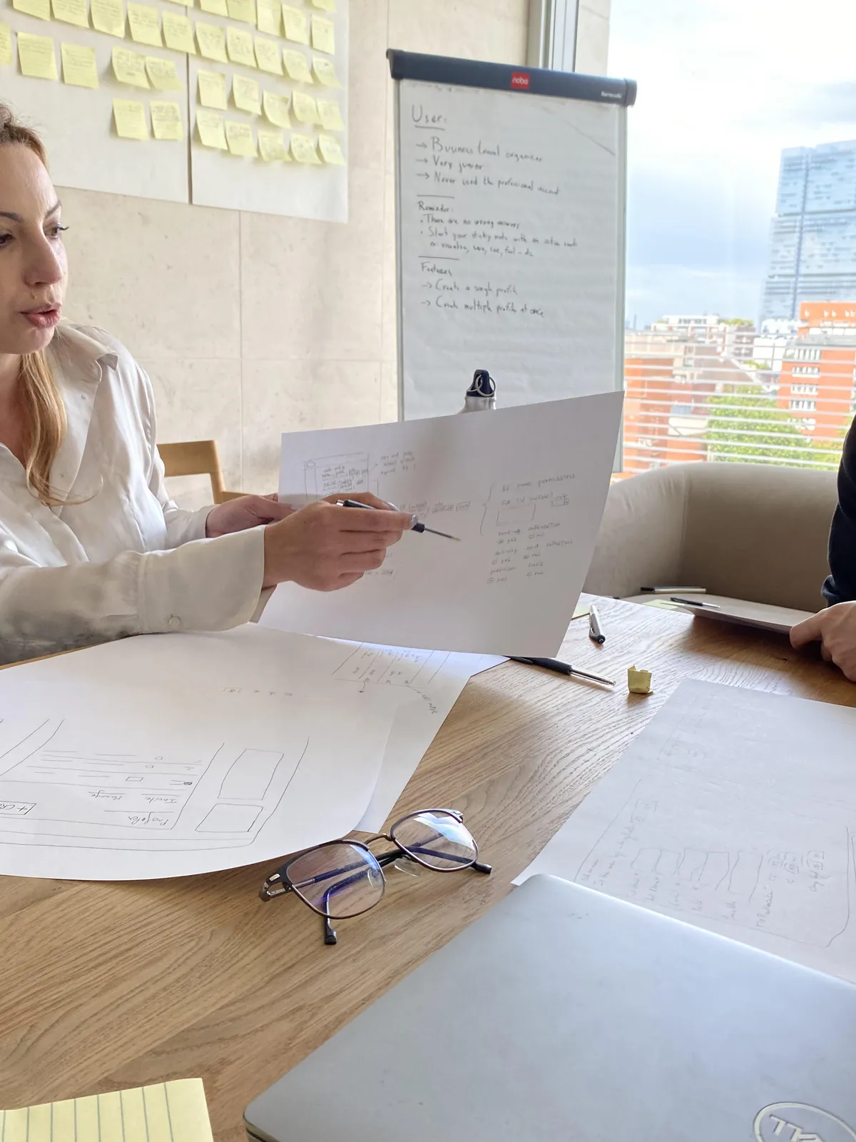
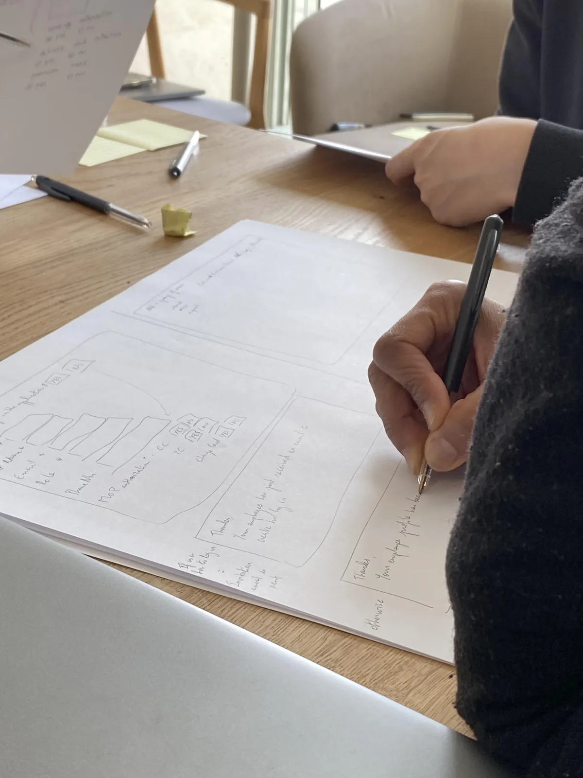
Throughout the project, I facilitated ideation workshops to explore solutions, design reviews to align the team on choices, and user research prep sessions. These workshops aren't wasted time — they're time saved. Everyone understands the "why" behind each decision.
The product evolved in short cycles, incorporating feedback from product managers, business teams, and developers. I also defined usability KPIs to track — so we always knew if we were heading in the right direction, not just moving fast.
Same Action, Three Behaviours
A look at the product itself — starting with the clearest proof of the three-profile logic: deleting an account behaves completely differently depending on who's asking.
See the flow adapt in real time depending on who's deleting the account — Owner, Admin, or Driver. Best experienced full-screen.
Open prototype (desktop)Designing for scale, not just for the happy path
Owners managing dozens or hundreds of drivers shouldn't have to add them one by one. This flow lets them import a whole team at once from an Excel template — a small feature, but a real signal that the product was designed for how B2B teams actually operate.
Add a whole team at once from an Excel template, instead of one driver at a time. Best experienced full-screen.
Open prototype (desktop)Every section of the account
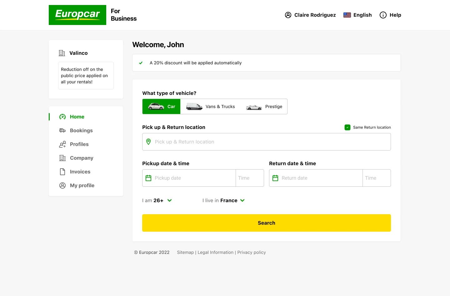
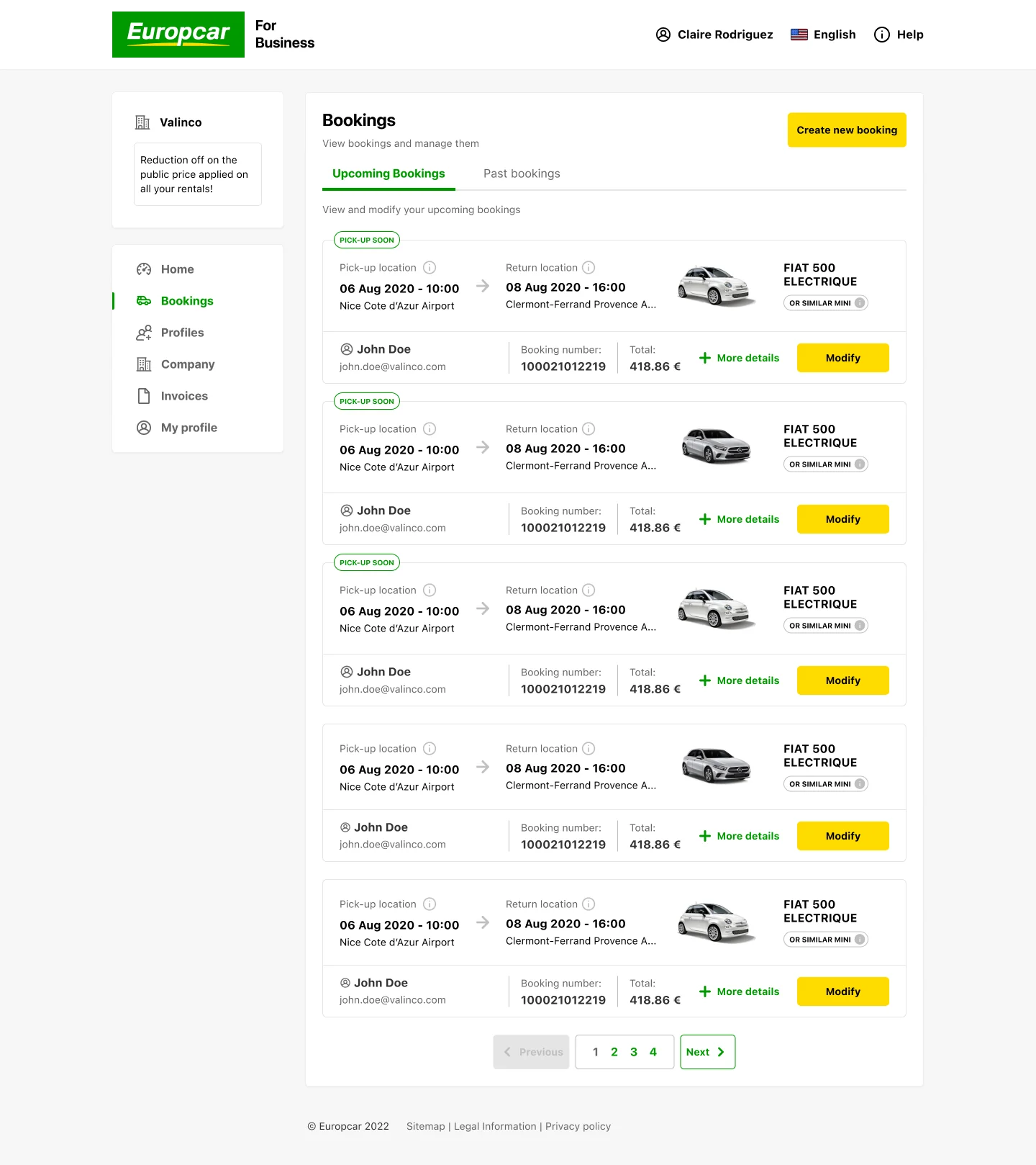
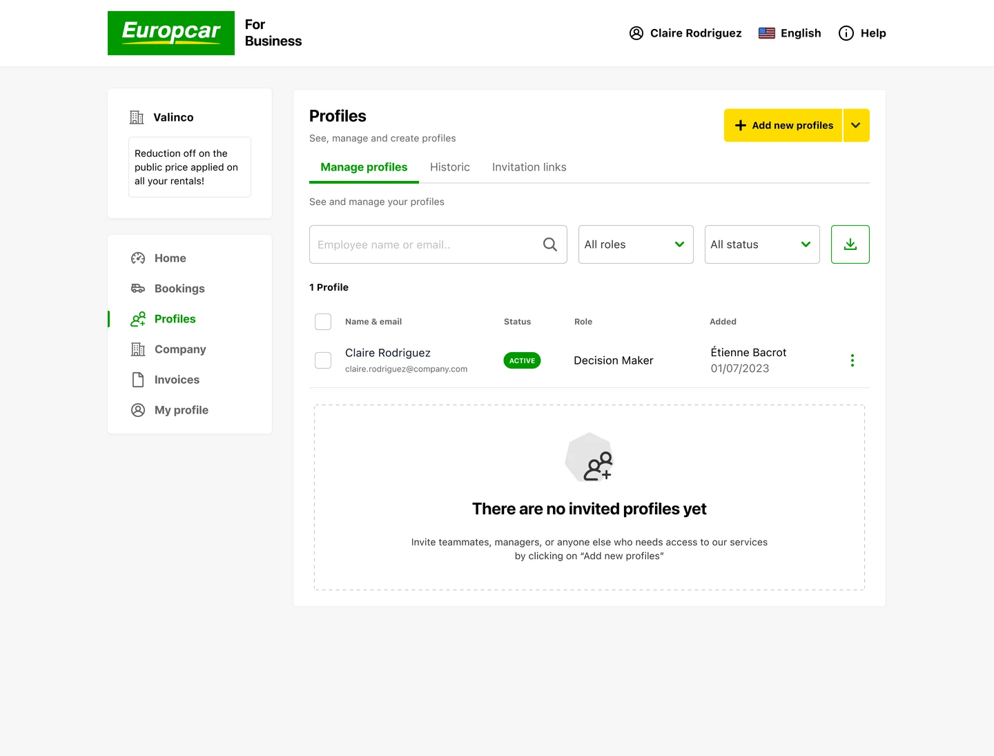
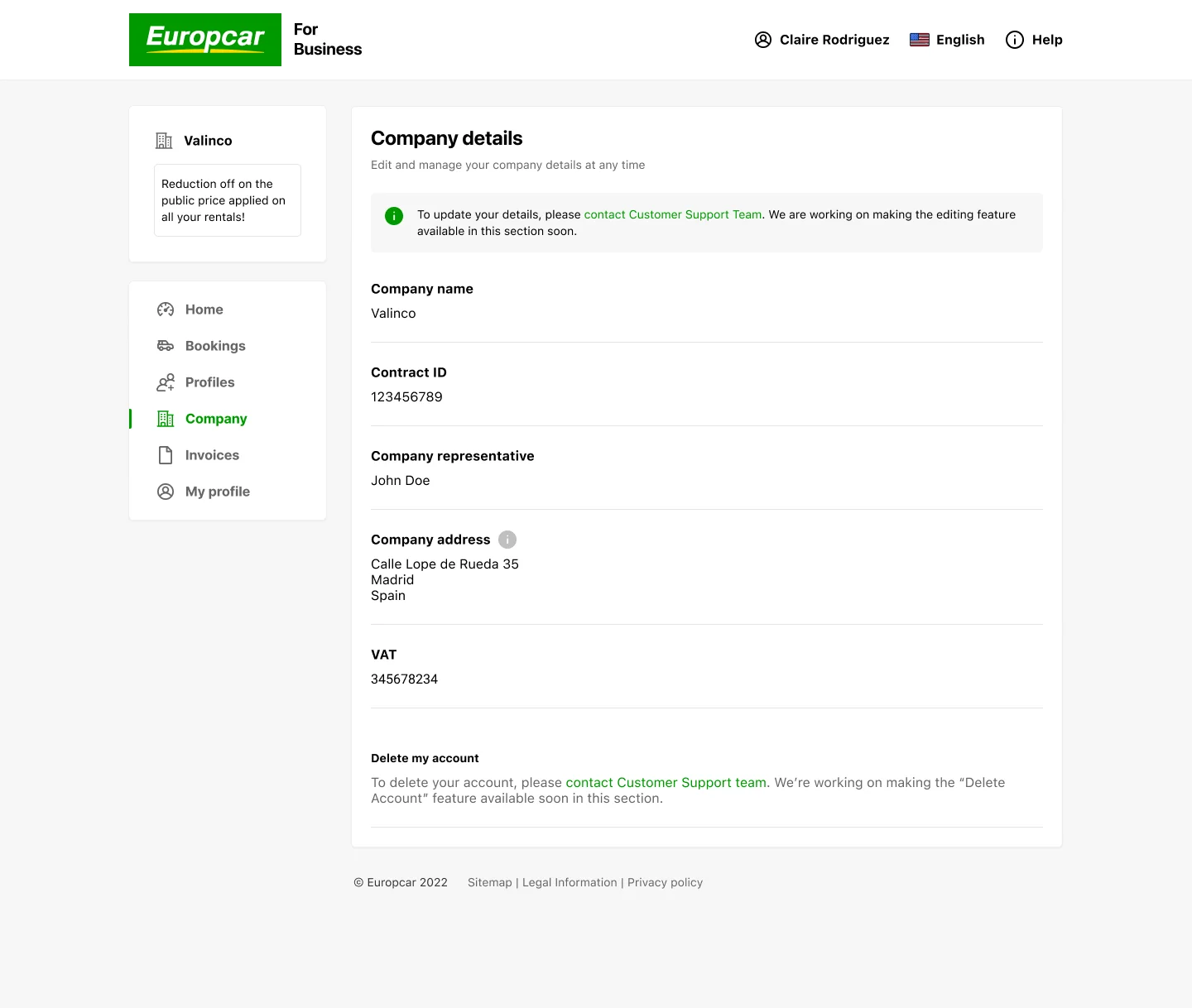
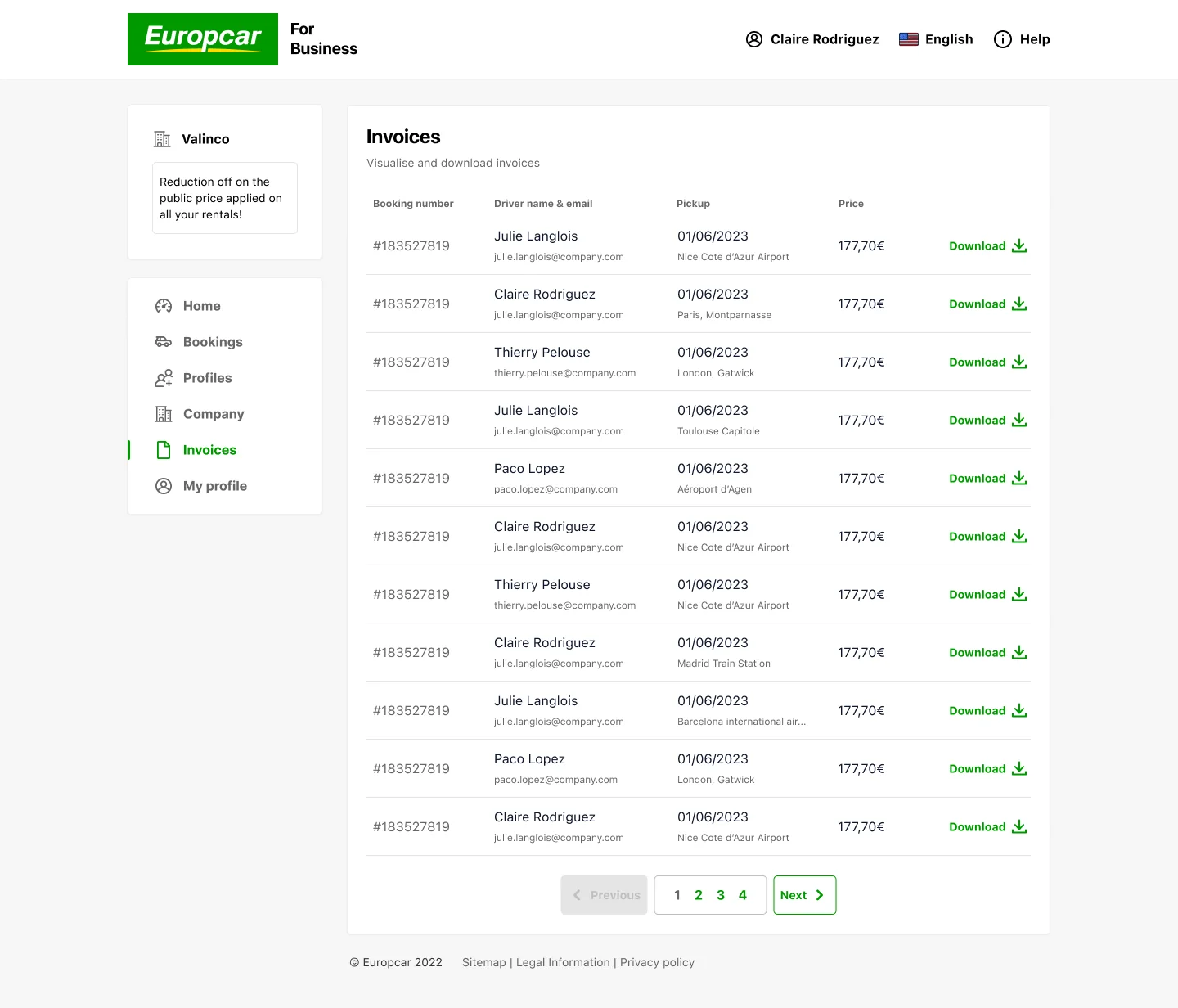
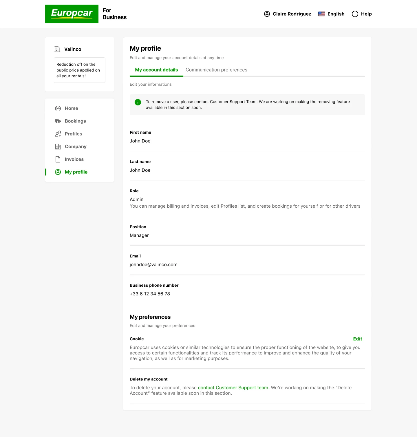
A tour of the product itself, from an Admin's point of view — home, bookings, drivers, company details, and invoices.
The Reassuring One
- Clear, structured experience
- Complex rules made understandable
- Consistent across all user profiles
- Rapid user adoption
- SUS score in the 80s — above the 68 industry average
- NPS in the 30–50 range
- 3 distinct user profiles designed
- Better alignment, fewer misunderstandings
- Increased autonomy from clear vision
- Faster decision-making overall