Two logins, one header: helping business customers find their way in
Business customers couldn't find their login, buried inside the personal one. I ran the workshop and the user tests that settled the debate between squads, then helped the team ship the fix the roadmap could afford.
Hidden in Plain Sight
Europcar.com serves two very different customers through one header: people renting a car for the weekend, and companies managing their drivers through the new Professional Account. Both shared a single "Log in" button, which opened the personal login. The business login was a small link at the bottom of that panel.
Watching Contentsquare session replays, Naima, a designer on the team, spotted the pattern: business customers opened the panel, scanned it, and left without finding their way in.
From Hunch to Evidence
I proposed a short, structured plan: ideate with the designers who own the personal login, narrow down to two concepts, then let users decide. Without it, the topic would have stayed a debate between squads.
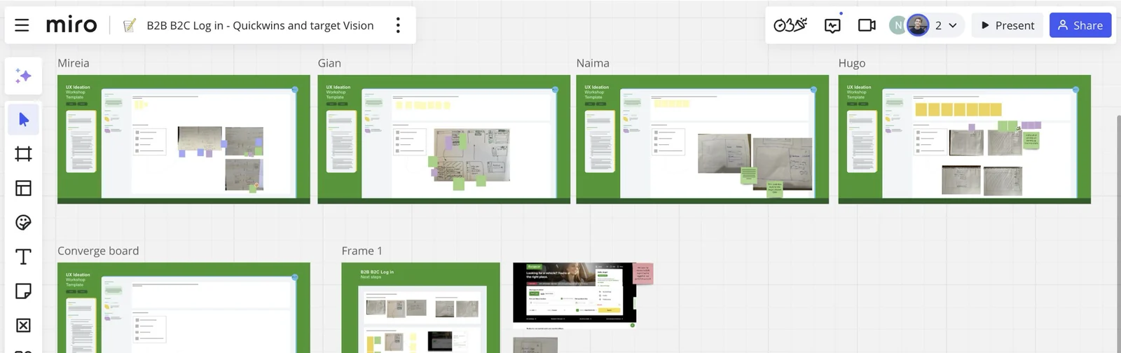
I facilitated an ideation workshop with designers from both the business and the personal squads. Everyone sketched on their own first, then we converged on one board. Two concepts made the cut: a login flyout splitting personal and business accounts, and a highlighted banner inside the existing panel.
The squads leaned toward the flyout, but the personal login team worried it would hurt their numbers. Rather than argue, I built three Figma prototypes and ran unmoderated tests on Maze with 17 UK business renters, aged 30 to 65, on desktop.
I analysed every session recording, presented the findings to the global design team, and logged the insights in Dovetail, our research repository, so they would outlive the project.
Three Scenarios, One Clear Winner
Two concepts, three scenarios: find the business login with the banner, then log in with the flyout from both a personal and a business angle.
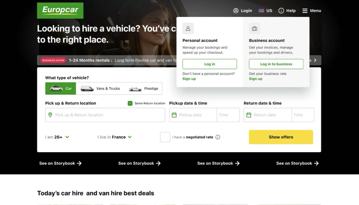
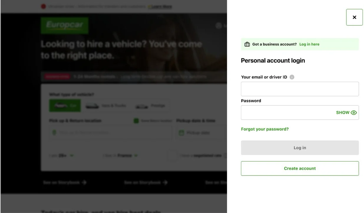
- 1/5 noticed the banner right away
- 4/5 went straight to the personal login form
- "There should be distinct options for business and personal accounts."
- 6/6 completed the task
- No one ended up on the business login
- No impact on personal logins
- 5/6 completed the task
- The one wrong turn was corrected quickly
- 11/12 successful flyout sessions overall
The finding nobody asked for
10 of the 17 testers opened the burger menu first to look for the login. On desktop, people expect it at the top right, and our "Log in" link was drowned out next to the country flag. I documented it with a quick recommendation: give the login a real button and rethink the desktop header.


The Right Fix for Now
The flyout won on every count. It still didn't ship: the header component carried heavy technical debt, and the personal squad was about to merge personal and business accounts into a single login, which would make the flyout temporary anyway.
So we went back to the banner, informed by the tests: bigger, at the very top of the panel, matching the visual weight of the personal login title. A change the roadmap could afford, while the team focused on migrating legacy business users.
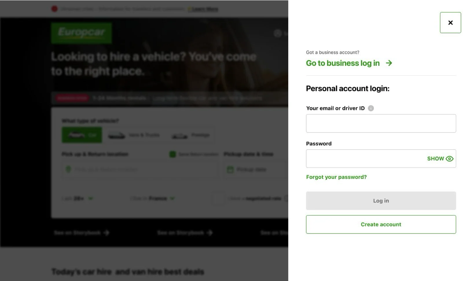
- Business login visible at first glance
- Fewer support tickets about accessing the Professional Account
- Higher click rate toward the business login
- 17 testers, 3 scenarios
- Zero impact on personal logins
- Insights stored in Dovetail for the single-login project
- A cross-squad debate settled with data, not opinions
- Business and personal designers aligned on one approach
- Header issues documented for a future redesign