Booking a rental car, start to finish
Years of UX debt had turned a car rental booking flow into a maze. I rebuilt it from the ground up — and testing showed a 92% task success rate, up from a funnel most users couldn't finish.
The One That Hurt
Ever tried booking something online and thought "why the hell is this so complicated?" That was Goldcar's booking funnel. Except it wasn't just frustrating for users — it was a business disaster.
Years of UX debt had piled up. Every team had added their feature without a holistic view. The result? A journey that felt more like a maze than a path to renting a car.
- Users were abandoning in droves
- Business teams were screaming about conversion rates
- Developers didn't know which fire to put out first
- And no one had a clear picture of the whole journey
Bringing Structure to Chaos
I didn't start with pixels. I started with understanding — then rebuilt from the ground up.
I ran a heuristic UX audit — going through the funnel with a fine-tooth comb to spot every friction point. Then I ran Design Thinking workshops with product and business teams. Not soul-crushing corporate meetings — real hands-on sessions with post-its everywhere and genuine debates. The goal: align on what truly mattered for both users and the business.
Once I had the diagnosis, I restructured the entire journey: simplified steps, prioritised critical information first, and removed unnecessary friction. Every decision was balanced between what's good for the user, what's technically feasible, and what makes business sense. Design as mediation, not decoration.
Goldcar didn't really have a Design System. So I built one: color palette, typography, component system (Atomic Design), and usage guidelines. I drew inspiration from Europcar's Design System while creating something uniquely Goldcar. This became the foundation for every future design decision.
I didn't lock myself in a room and emerge with the "perfect design." I ran regular sessions with product, tech, and business. Remote user testing brought real feedback, not assumptions. And when things got tense — because everyone has opinions about design — I knew when to listen, when to push back, and how to keep everyone moving forward.
From Concept to Screen
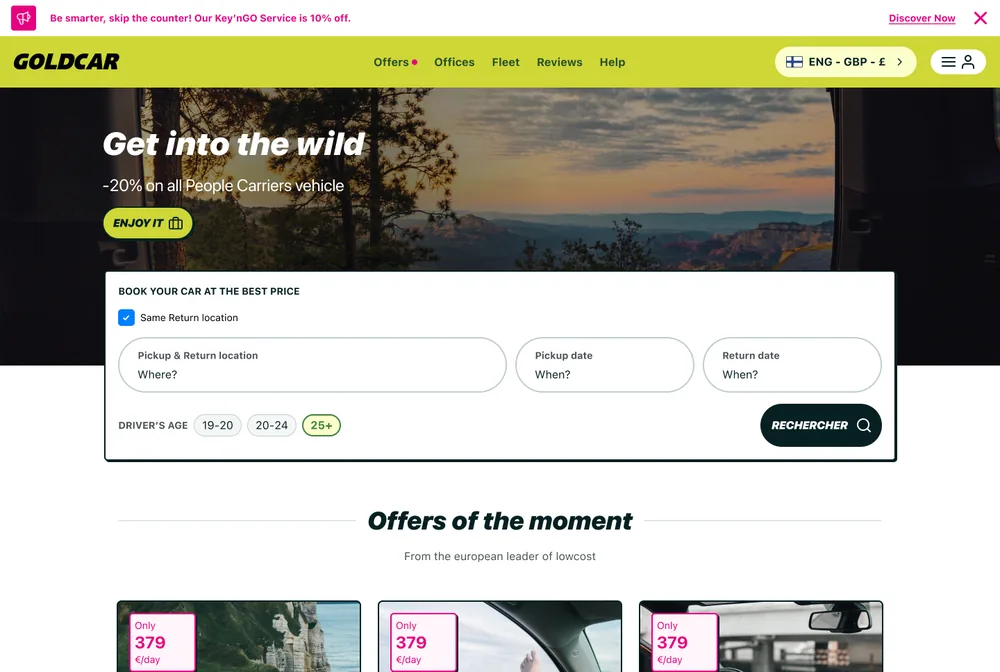
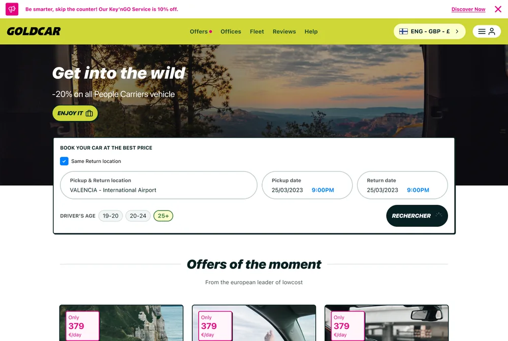
A look at the most critical screens in the flow: the homepage, the final checkout step, and the interaction thinking behind the booking widget itself.
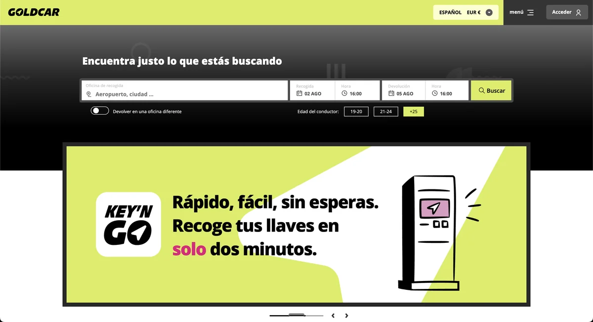
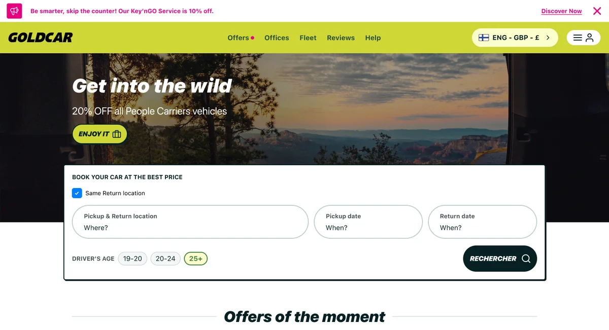
Drag to compare — Goldcar's site has evolved since, this isn't a literal before/after of the same flow.
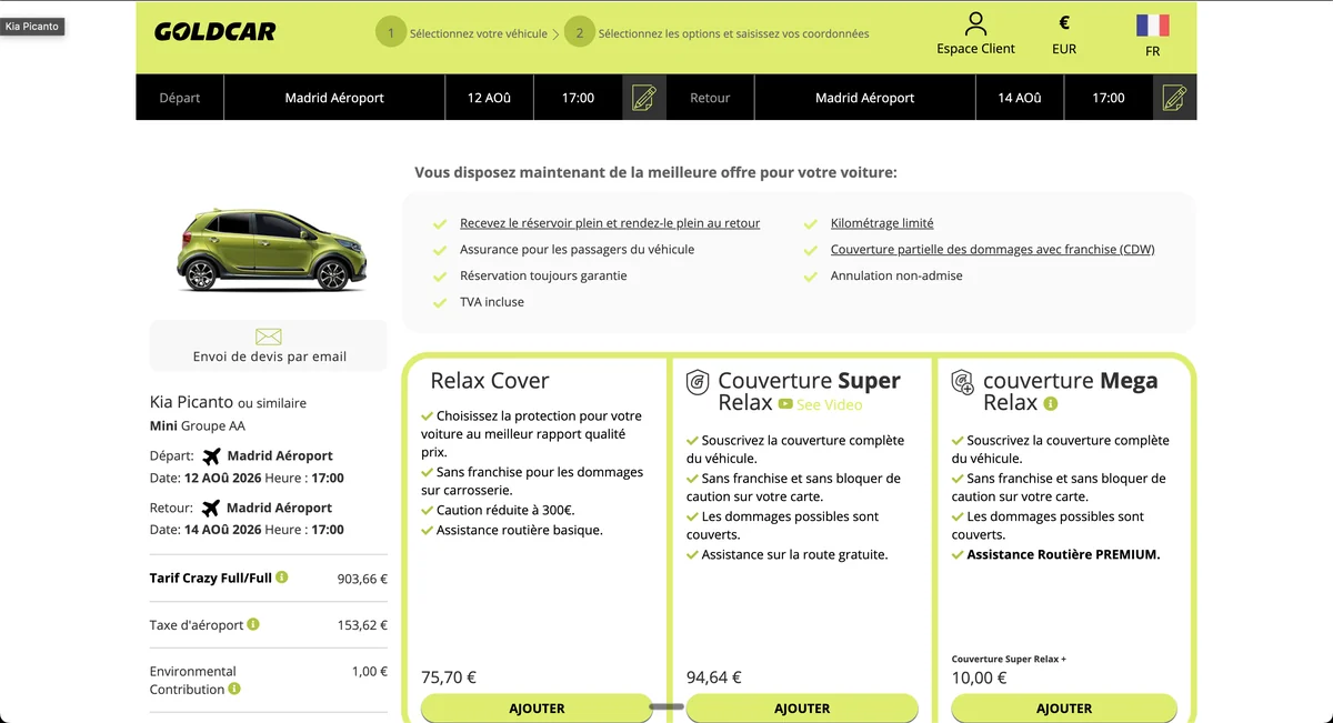
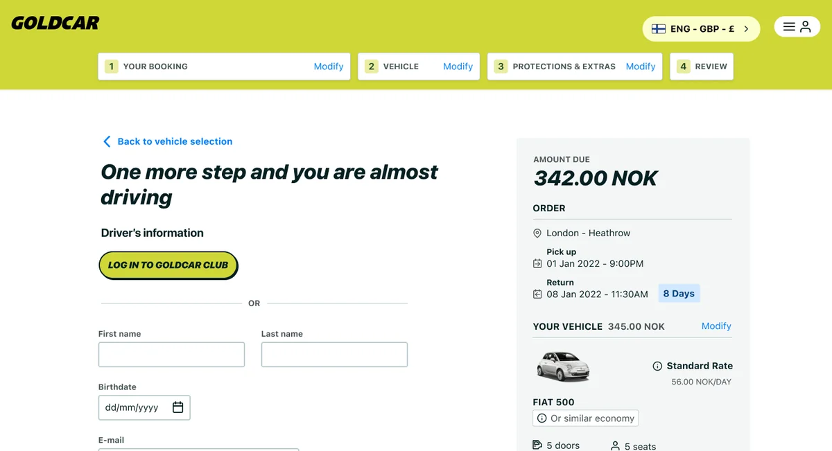
Pay & Review step — drag to compare.
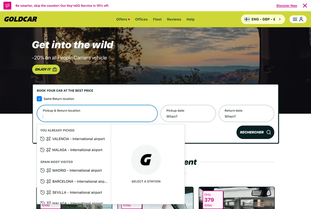
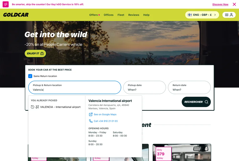
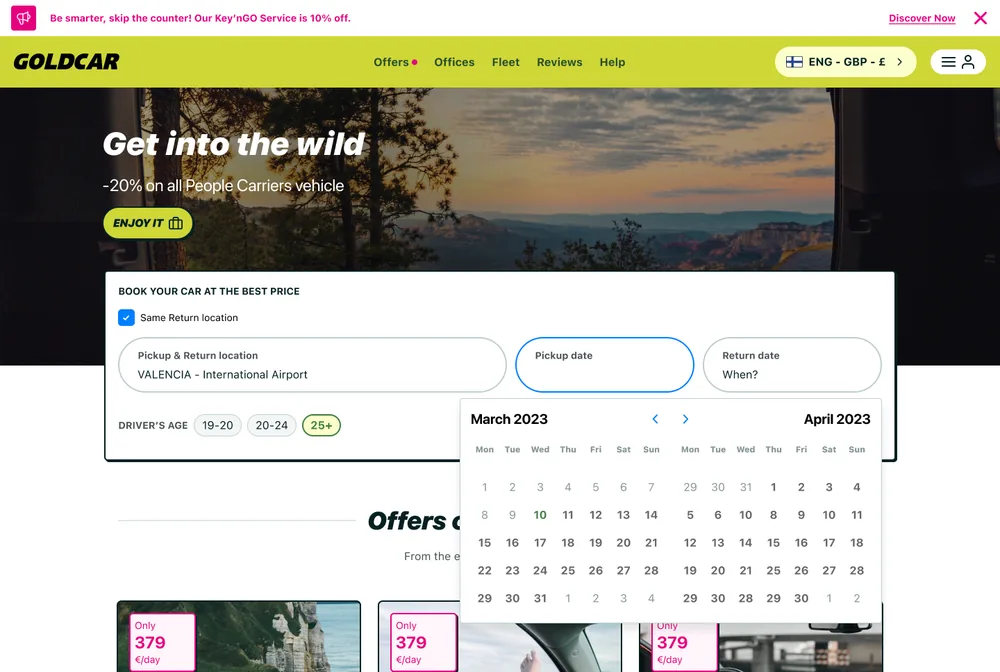
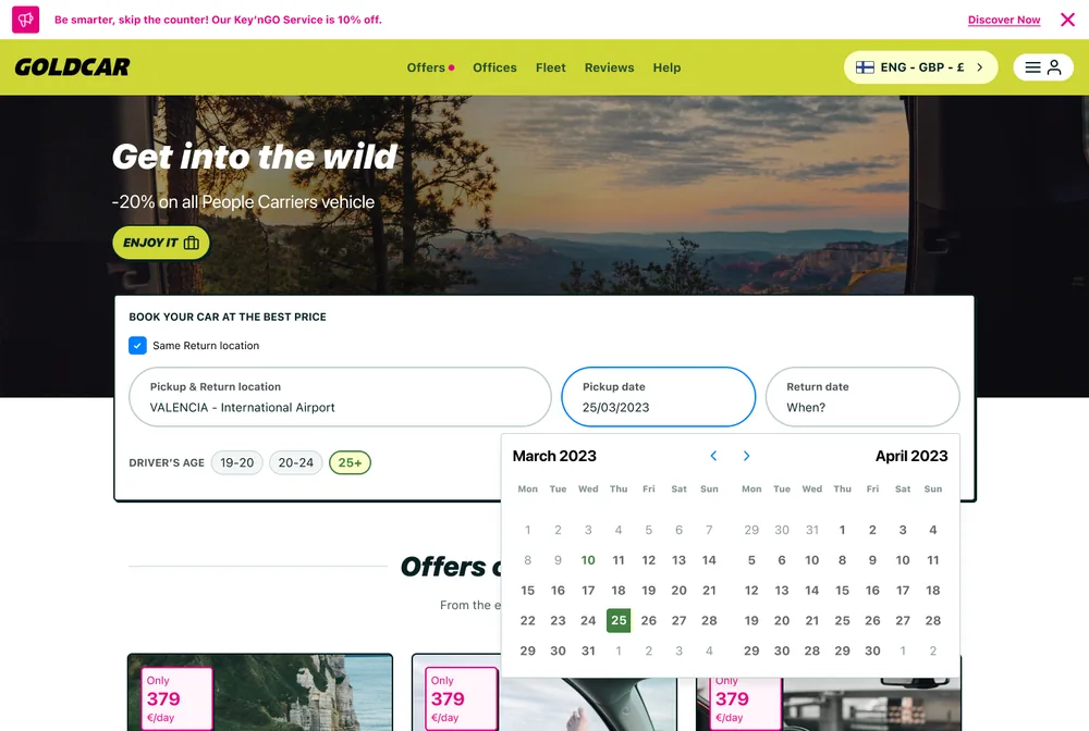
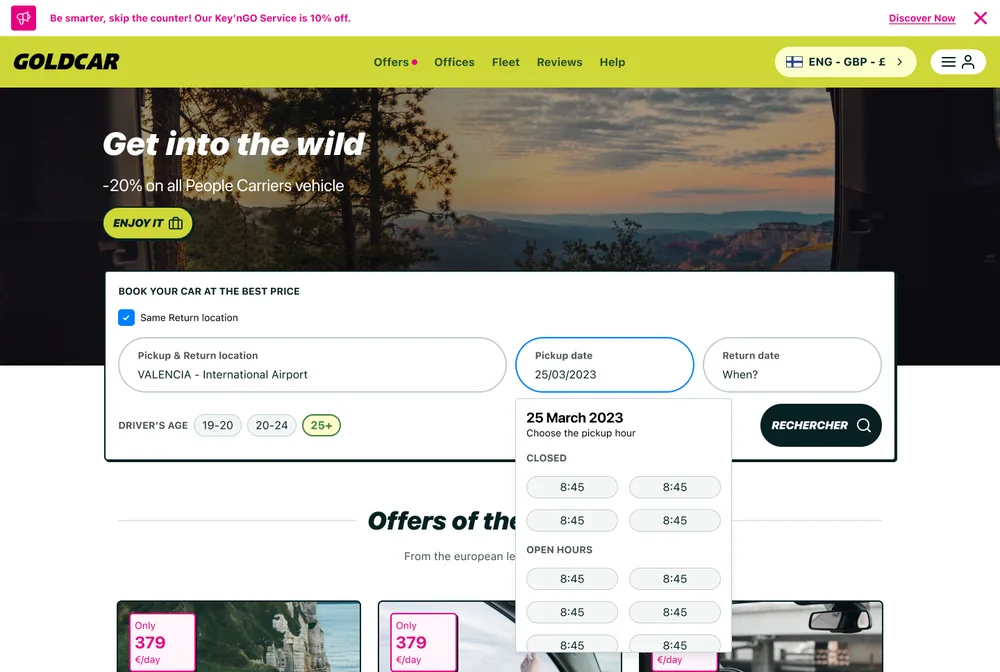
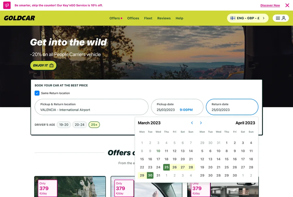
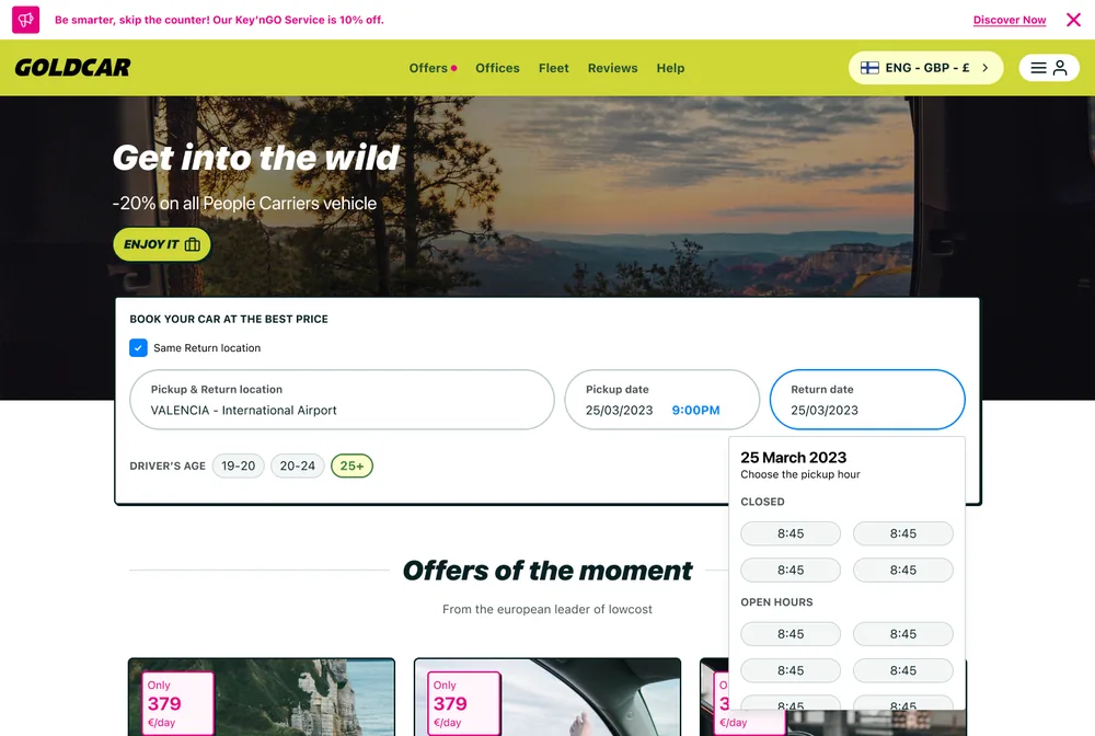
Designing the booking widget's behaviour
The booking widget is the most critical component in the entire funnel, so it got its own dedicated ideation workshop, backed by a heavy round of competitive benchmarking. These frames capture the state-by-state thinking — including surfacing office opening hours before asking for a pickup time, so users don't waste a search on a closed office.
The One That Feels Good
- 92% task success rate
- 78/100 SUS score, above the 68 industry average
- Consistently positive feedback across every test round
- Users completing without struggle
- Business & product teams levelled up their UX maturity
- My workshop methodology adopted by other designers
- Design System became THE Goldcar reference
- Proved UX and business don't need to compromise
- Positioned me as a senior designer who de-risks a redesign before a single line of code is written
- Chaos turned into something that actually works