Hugo Chappe
Work About Contact
Work & Case Studies
Case Study · Virtuo · B2C

Rent a car with only your mobile phone

Virtuo let people rent a car from their phone and skip the rental desk. The website's booking flow didn't live up to that promise. We redesigned it end to end, on mobile and desktop — and the conversion rate doubled.

2×
Conversion rate after launch
3
Design reviews per week with Virtuo's product team
~3 months
From handoff to live, built by Virtuo's teams
Role
Product Designer · Kirk Agency
Context
Car Rental · B2C · Web & App
Deliverables
User Journeys · Hi-Fi Wireframes · User Testing

A Desk-Less Promise, A Desk-Like Booking

Virtuo is a mobile-only car rental start-up founded in 2015: no counter, no paperwork, the car unlocks with your phone. Virtuo asked Kirk to rework the website's booking flow, the user account and the reservation page — responsive, on web and app.

  • The homepage booking pod confused users: they didn't get the service and hesitated to go further
  • Scope: black and white, high-fidelity wireframes — Virtuo's in-house designers owned the visual layer
  • First project for Clara and me as a fully autonomous design team
  • Coming from B2B SaaS, e-commerce and persuasive design were new ground

Four Phases, Short Loops

Phase 01
Map the journeys

We mapped the user journey across scenarios: does the user have a business account? What happens when they come from an airport? When do they create an account?

Phase 02
Prototype in high fidelity

Two black and white prototypes, mobile and desktop, built in Axure RP9. We redesigned pages and flows with persuasive design and ergonomics best practices, leaving the visual design to Virtuo's creative team.

Phase 03
Iterate fast

Three design reviews a week with Virtuo's product team to push flows further and stay aligned. The goal throughout: cut the time it takes to rent a car.

Phase 04
Test against the old version

We timed user testing sessions on the old and the new interface. The findings drove targeted fixes, especially on the airport scenario.

Where the Booking Happens
Booking pod - the first impression
Users can enter everything about their trip right on the homepage. Search results and station search were reworked too.
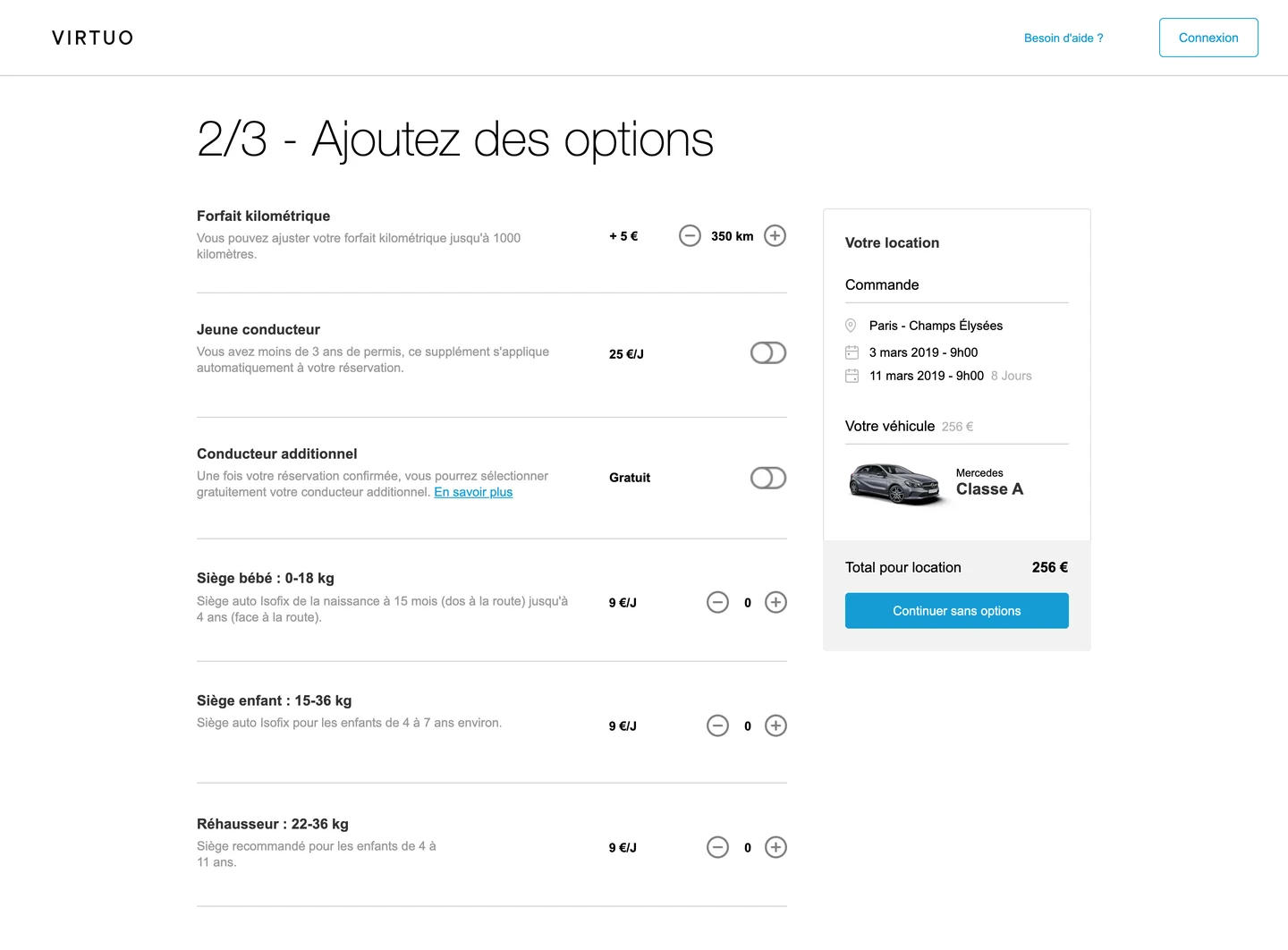
Renting flow - options
Insurance and extras presented clearly and persuasively, without crossing into dark patterns.
The full booking flow, from search to payment (47 s)
Account - navigation
A full redesign of the account section, built for reassurance and quick access. The information architecture went through several rounds of review and testing.
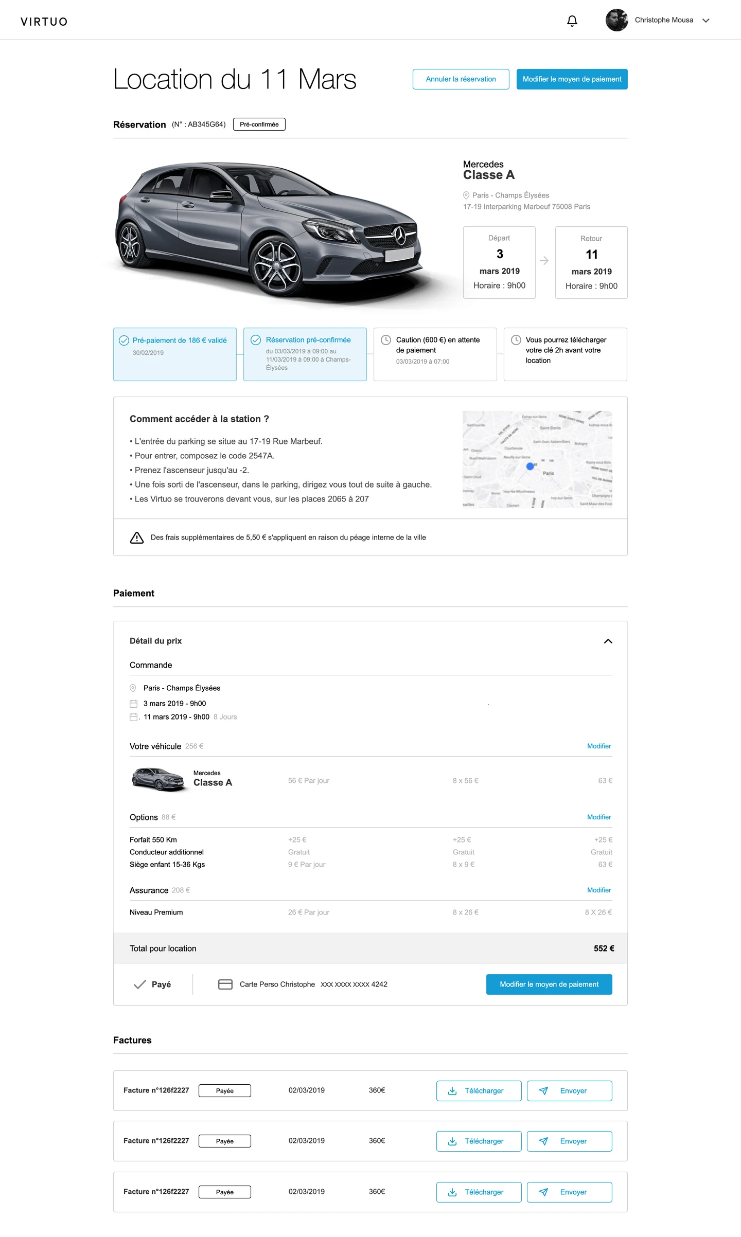
Account - your reservation
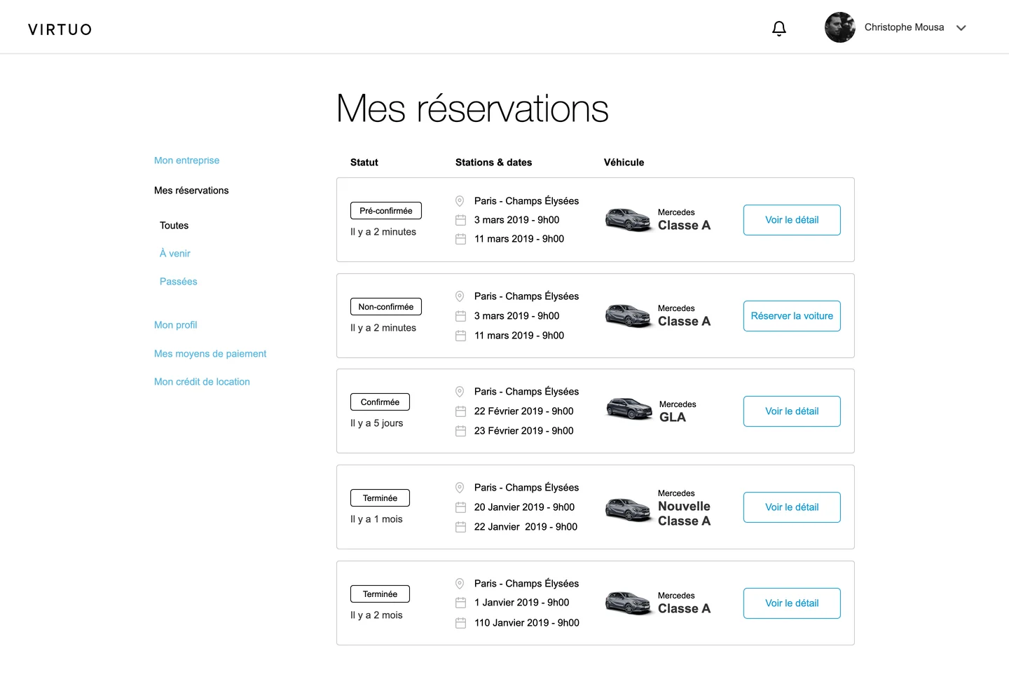
Clearer tracking of bookings, with order validation, billing and every document available to download.
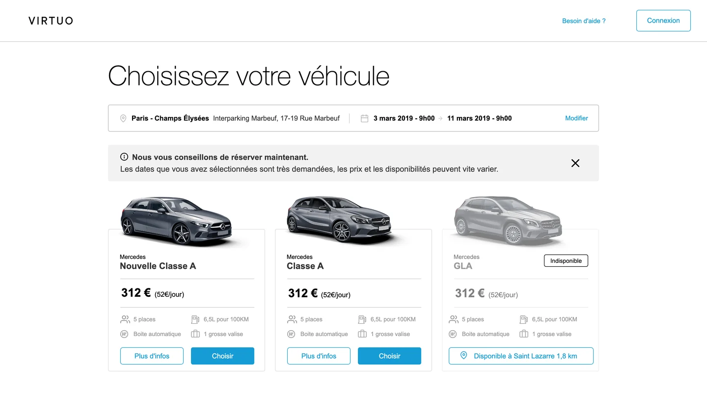
Vehicle selection - available cars, with a nearby alternative when one is unavailable
Vehicle selection
Step 1 of 3 - options, with the booking summary alongside
Options
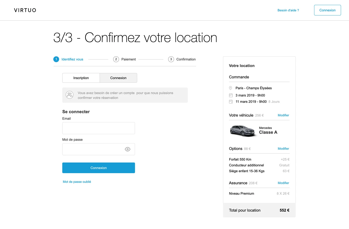
Step 3 of 3 - log in or sign up without leaving the checkout
Log in, without leaving the checkout
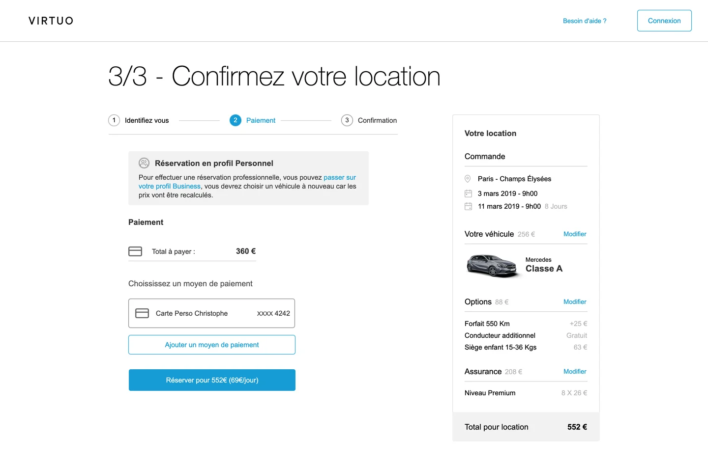
Checkout - payment with a saved card and the personal or business profile reminder
Checkout
My bookings - every reservation and its status
Booking details - station access, deposit and invoices
Booking details - station access, deposit & invoices
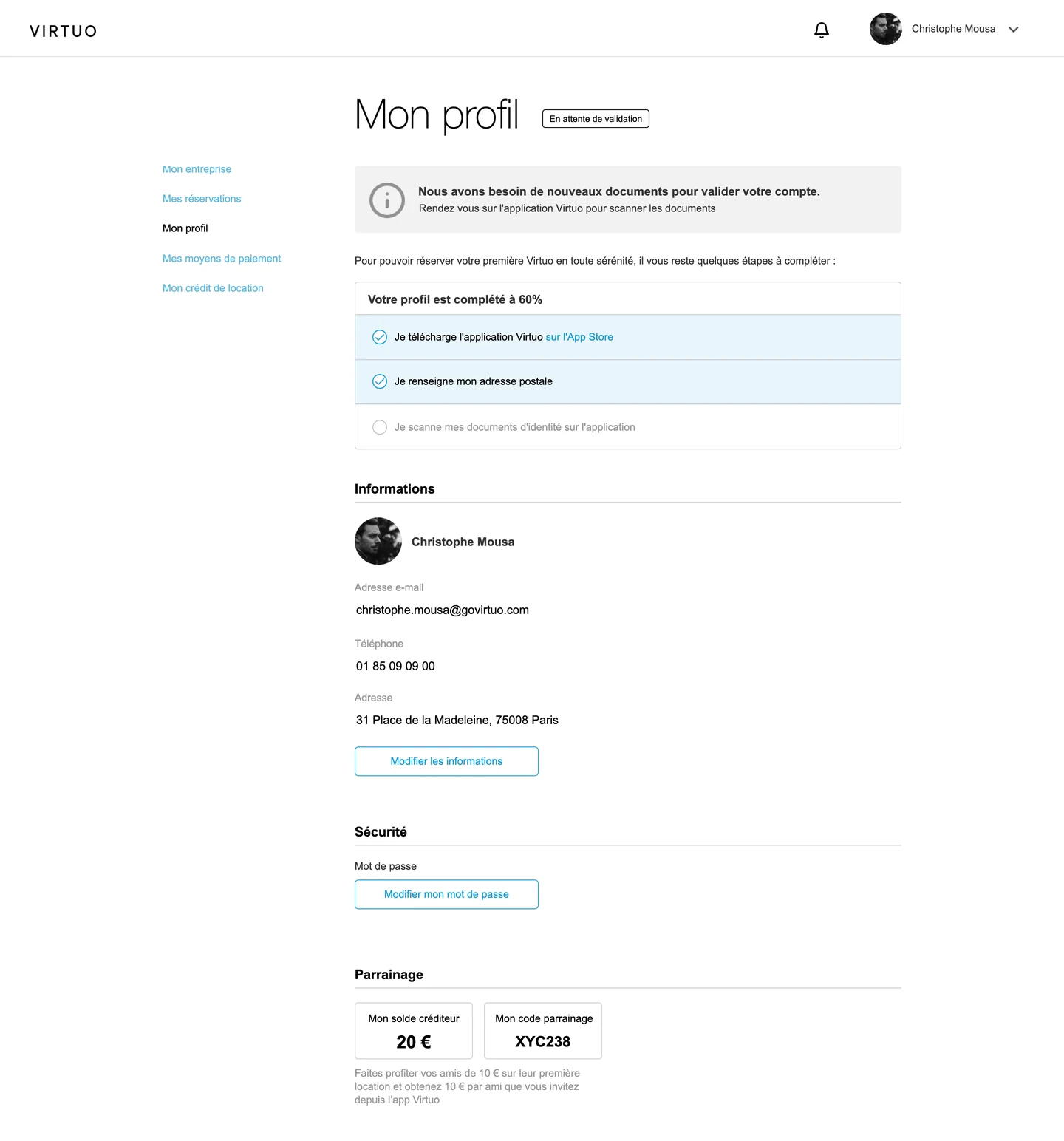
My profile - document checklist before the first rental
My profile - document checklist
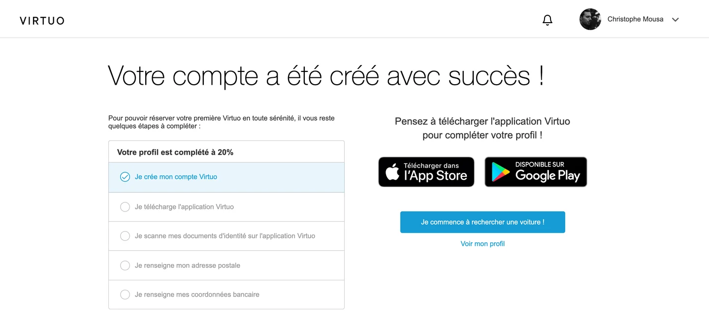
Account created - next steps and app download
Account created - next steps & app download

Twice the Conversions

The Delivery
  • Delivered on time
  • Mobile and desktop prototypes
  • Built by Virtuo's UI and dev teams in about 3 months
The Impact
  • Conversion rate doubled
  • Other KPIs moved in the same direction

Running a Project on My Own

Owning the client relationship
Organising the work, and knowing when to bring the client in.
Running workshops and design reviews
Preparing and leading them, three times a week.
Running and recording user tests
Timed sessions turned "is it better?" into a measurable answer.